Savvy Axis Logo SAY
XISS

CSS for Intermediate Learners

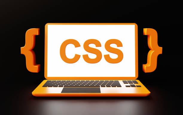
Take your web styling skills to the next level. This course dives deeper into CSS, focusing on advanced layouts, animations, and responsive design techniques. Transform your web pages into polished, dynamic, and interactive experiences.

4.6 Rating Intermediate Course 8 Weeks

About this Course

This Intermediate CSS course builds upon your foundational knowledge by introducing complex layout techniques, CSS animations, and best practices for responsive design. Through hands-on projects and exercises, you'll gain skills to design modern and dynamic websites.

Course Objective

To deepen understanding of CSS, enabling students to create advanced, responsive designs with a focus on layout flexibility, animations, and visual storytelling.

Skills you'll gain

Advanced Flexbox and Grid Layouts CSS Animations and Transitions Responsive Design Best Practices

Syllabus

  • Course Overview and Environment Setup
  • Understanding CSS Syntax and Selectors
  • Working with Colors, Fonts, and Text Styles
  • Basic Box Model Concepts
  • Styling Backgrounds and Borders
Practice Task: Create a simple styled webpage with text, colors, and borders.

  • Display Properties: Inline, Block, Inline-Block
  • Using Margins and Padding
  • Floating and Clearing Elements
  • Positioning: Static, Relative, Absolute, Fixed
  • Creating Simple Layouts with CSS
Practice Task: Design a two-column webpage layout using floats and positioning.

  • Introduction to Responsive Web Design
  • Understanding Viewports and Media Queries
  • Flexbox: Flexible Box Layout
  • Creating Fluid Grids with Flexbox
  • Advanced Flexbox Techniques for Complex Layouts
Practice Task: Create a responsive navigation bar using Flexbox.

Final Project: Complete a project applying skills from Weeks 1-3.
  • Project Work.
  • Project Refinement.
  • Project Presentation and Wrap-Up.

  • Understanding Flexbox Concepts
  • Creating Responsive Layouts with Flexbox
  • Introduction to CSS Grid
  • Building Complex Grid Layouts
  • Combining Flexbox and Grid for Layout Flexibility
Practice Task: Create a responsive card layout using both Flexbox and Grid.

  • Introduction to CSS Transitions
  • Creating Hover Effects
  • Keyframes and CSS Animations
  • Applying Animations to Elements
  • Combining Animations and Transitions
Practice Task: Design a button with interactive hover and click animations.

  • Introduction to Responsive Design
  • Using Media Queries for Device Adaptation
  • Fluid Layouts and Adaptive Elements
  • Responsive Typography and Images
  • Testing for Cross-Device Compatibility
Practice Task: Create a fully responsive webpage layout that adjusts across devices.

Final Project: Complete a comprehensive webpage styling project using skills from Weeks 1-7.
  • Project Planning and Layout Design
  • Styling and Adding Interactivity
  • Final Responsive Testing and Adjustments
  • Project Presentation and Wrap-Up

About the Instructor

Shalini Baskaran

Founder & CEO

4.98 Instructor rating

40 Students

Shalini Baskaran, is the CEO and Curriculum Director at Savvy Axiss. With a deep background in computer science, she has designed numerous courses to build strong foundations for aspiring programmers. Known for her clear, practical teaching style, she excels at making complex topics accessible. She is passionate about empowering students with real-world skills, and she looks forward to guiding you through this foundational journey in programming.

Fee ₹ 1999

999

Duration

8 Weeks

Class Time

1.5 Hours

Enrolled

250 students

Language

English / Tamil

Skill Level

Intermediate

Schedule

Monday to Friday

Certificate

Yes